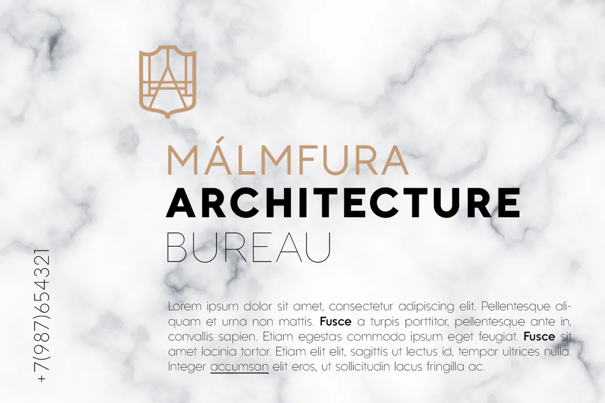
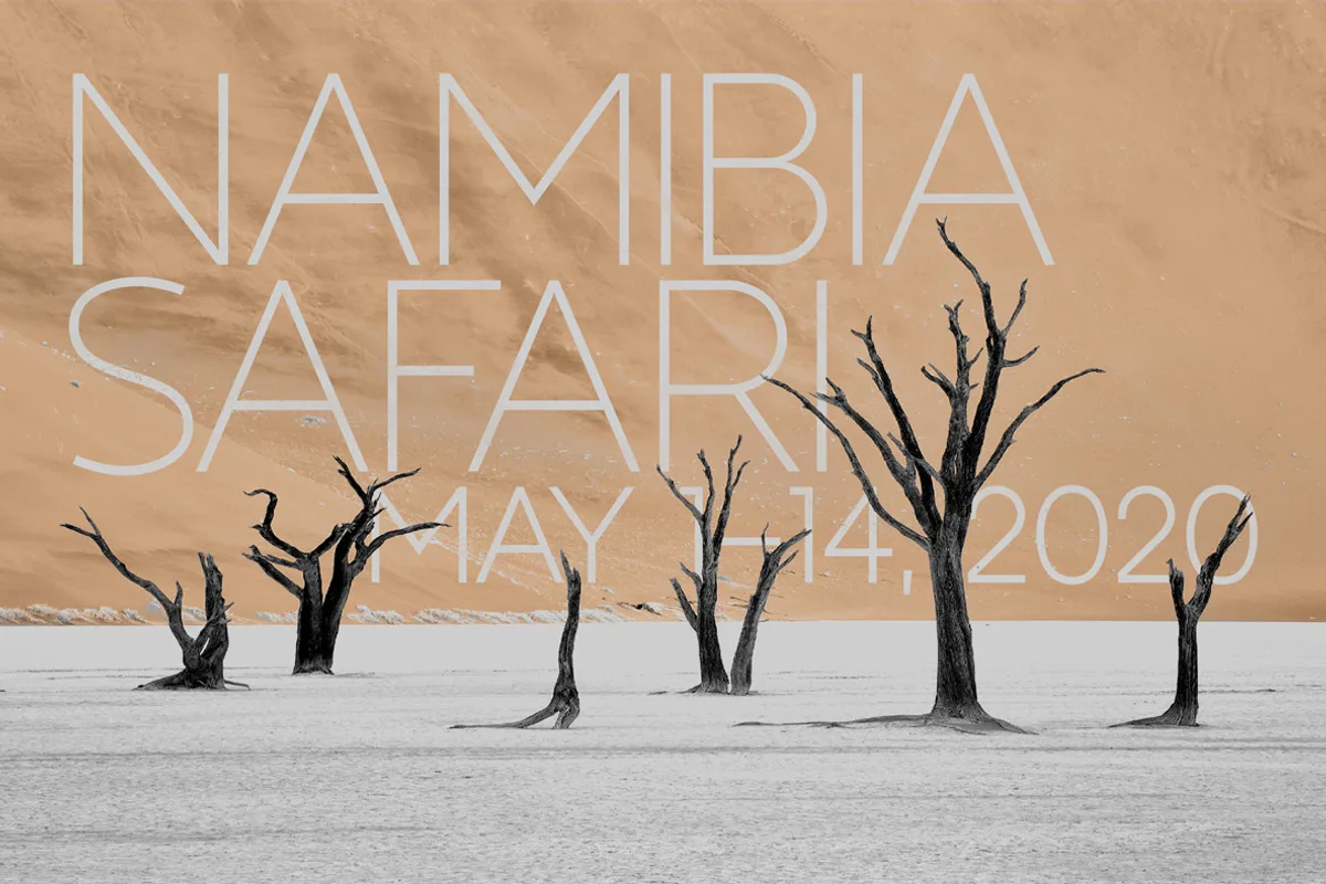
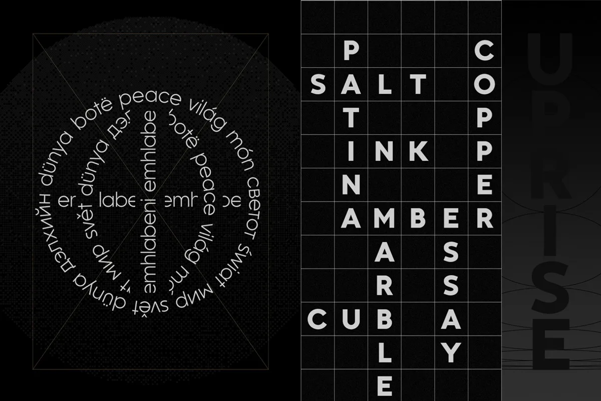
Kontora Font is elegant, universal and laconic geometric sans serif. It has a minimal amount of decor, mostly modern proportions and letterforms, but at the same time, it has a touch of retro-constructivist aesthetics.
Inspired by the early 20th-century geometric sans-serif fonts like Futura and Akzidenz Grotesk, Kontora taking a few steps to become more relevant to modern needs: shorter ascender and descender height, more open and sleek form of letters S and s, flat r shoulder, K and k letterforms with crossbar joint, square titles, flat apexes, more balanced width of capitals, a tendency to symmetry in letterforms (Q,t,u) and tighter spacing.
The second version of Kontora Sans comes in 9 weights, it has 590 glyphs. It has basic ligatures and two sets of stylistic alternates. Since the first version, Kontora also went through the number of stylistic changes, which are presented on the second slide above.
Features:
- 590 glyphs
- 9 weights
- 7528 kerning pairs
- Ligatures
- Good Cyrillic