Built for screens, not for print
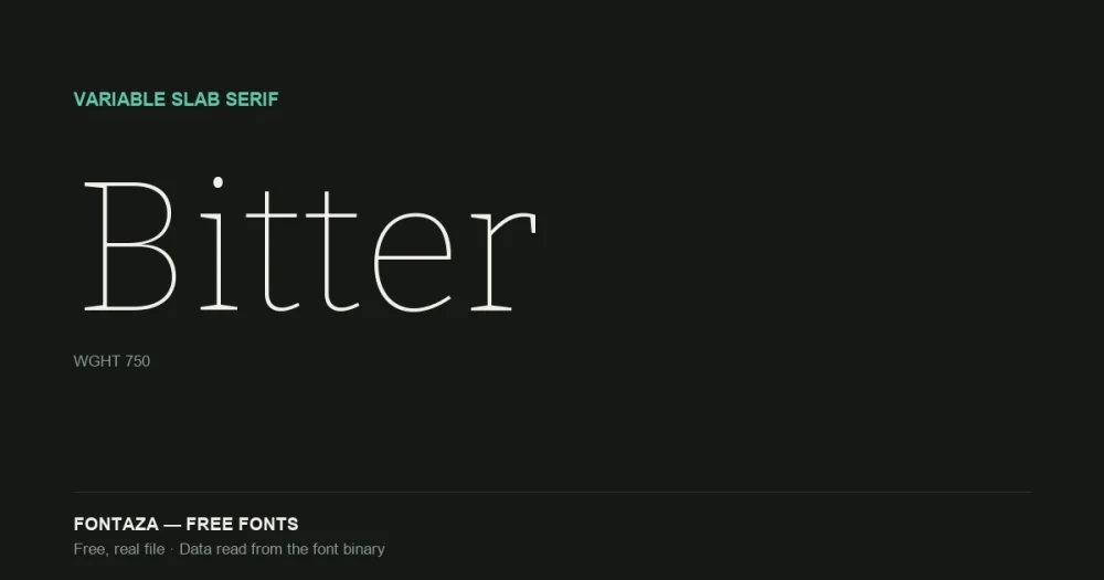
Bitter was designed by Sol Matas as a slab serif specifically for comfortable reading on screens — a category most slab serifs weren’t built for; the style traditionally leans display/headline. It’s since grown into a full variable family maintained by the Bitter Project Authors, currently at version 3.021.
We read the data directly from the font binary. Here’s what’s actually in there:
| Property | Value |
|---|---|
| Variable axis | Weight (wght), 100 → 900, default 100 (Thin) |
| Named weights | 9 (Thin through Black) |
| Glyphs | 1,542 |
| Codepoints | 977 |
| OpenType features | 26 |
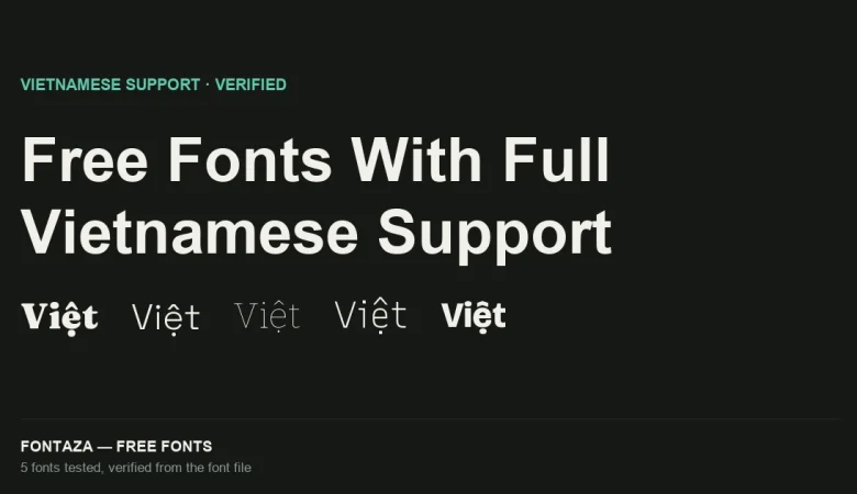
| Vietnamese support | Full |
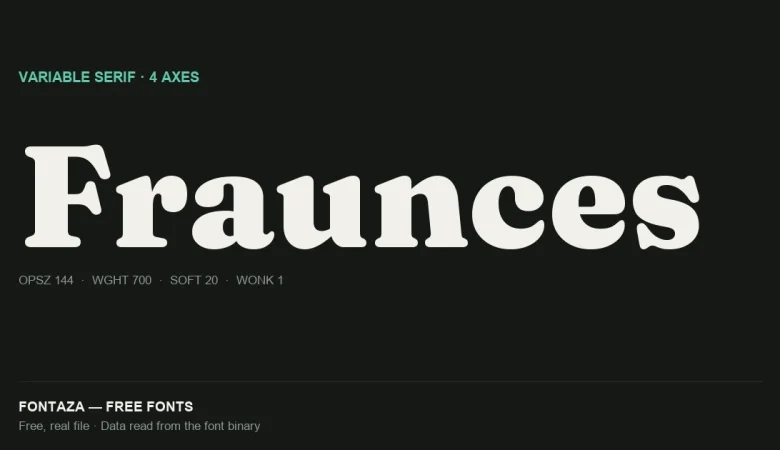
The default weight sitting at 100 (Thin) is worth flagging — the opposite trap from Fraunces (defaults to 900/Black) and Space Grotesk (defaults to 300/Light), both covered separately on this site. Embed Bitter without setting font-weight explicitly and you’ll render the thinnest possible cut, which at body-text sizes can look broken rather than elegant.
Download Bitter
Includes the OFL license file. Keep it in the package if you redistribute.
26 OpenType features — a genuinely complete set
| Category | Features |
|---|---|
| Figures | lnum onum pnum tnum numr dnom frac zero |
| Case | c2sc smcp case ordn |
| Positioning | kern mark mkmk |
| Alternates | ss01 salt* |
| Other | aalt calt dlig liga locl ccmp sinf subs sups rvrn |
*salt appears in some Bitter builds; not present in every static instance — check the specific weight you embed.
Two features stand out for a slab serif at this price point (free):
Small capitals (smcp/c2sc) — genuine drawn small caps, not scaled-down capitals. Rare in free fonts; useful for acronyms, drop-cap treatments, and any editorial layout that needs a quieter alternative to full caps.
Tabular figures (tnum) alongside oldstyle figures (onum) — you get both aligned-column numerals for data and text-friendly numerals that sit within the x-height for running prose. Most fonts offer one or the other; Bitter has both.
Language and glyph coverage
1,542 glyphs covering 977 Unicode codepoints — one of the larger free character sets we’ve measured (compare Fraunces at 698, Space Grotesk at 1,001). Bitter fully covers Vietnamese (164 of 256 characters in the Latin Extended Additional block, including every stacked-diacritic combination) and fully covers Cyrillic (224 of 256) — a genuinely broad script range for a text-oriented free font.
Full language coverage: Vietnamese, Cyrillic, Spanish, French, German, Portuguese, Italian, Polish, Czech, Turkish, Romanian, Hungarian, Dutch, Nordic.
Metrics
| Metric | Value |
|---|---|
| Units per em | 1,000 |
| Ascender | 935 |
| Descender | −265 |
| Cap-height ratio | 0.692 |
| x-height ratio | 0.522 |
An x-height ratio of 0.522 — close to Montserrat’s 0.517 — confirms the “built for screens” design brief: generous x-height keeps slab serifs, normally a display category, legible at body-text sizes.
When to use it — and when not to
Good fit: long-form web reading, editorial sites, documentation, anything wanting a serif’s authority with a sans-serif’s screen legibility. Poor fit: situations needing a true display slab with heavier personality at large sizes — for that, see the premium option above.
Related
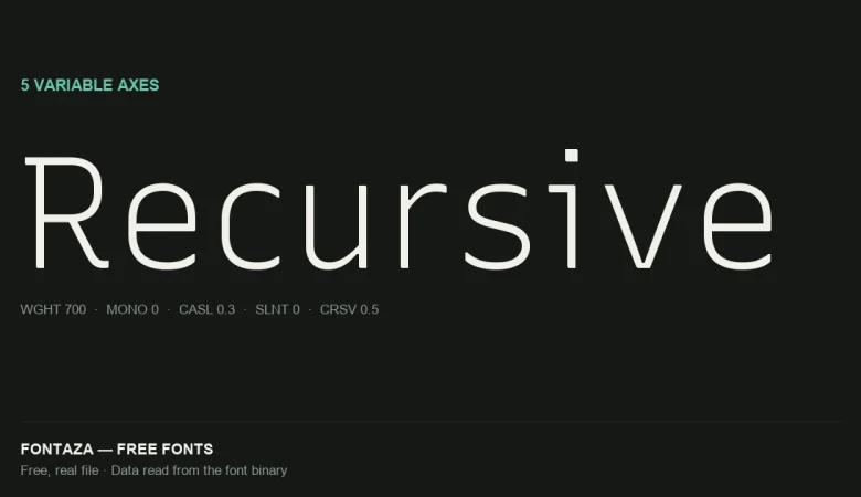
- Recursive: 5 Variable Axes Explained
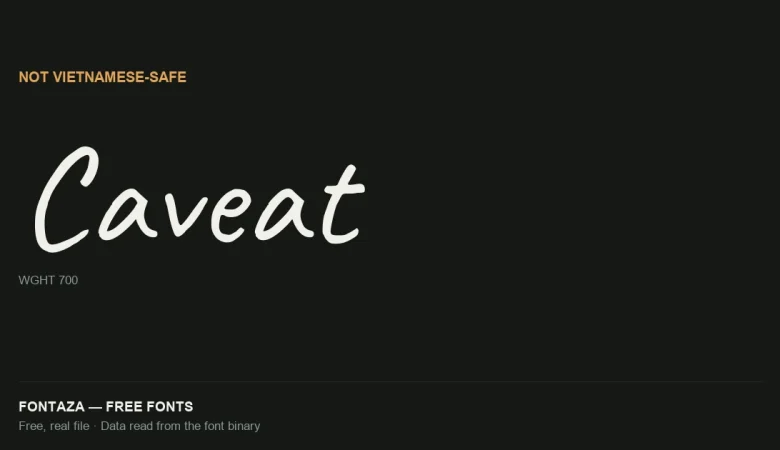
- Caveat: Why It’s Not Vietnamese-Safe
- Free Fonts With Full Vietnamese Support (Verified From the Font File)
Data on this page was read directly from the font binary — axis table, glyph count, character coverage and OpenType feature list. Last verified against Bitter version 3.021.