Three axes, and the defaults will surprise you
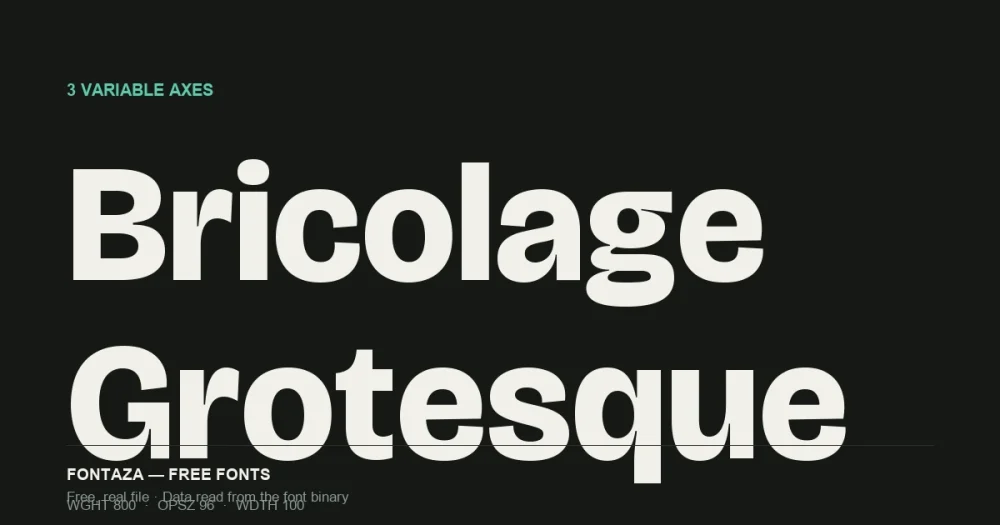
Bricolage Grotesque was designed by Mathieu Triay of Atelier Triay — a grotesque sans built as a genuine 3-axis variable file, not just a weight range. We read the axis table directly from the binary:
| Axis | Tag | Range | Default |
|---|---|---|---|
| Weight | wght | 200 → 800 | 800 (ExtraBold) |
| Width | wdth | 75 → 100 | 100 |
| Optical Size | opsz | 12 → 96 | 96 (max) |
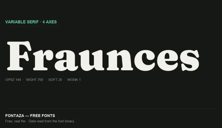
Both defaults sit at the heavy/large end, not the middle. Embed Bricolage Grotesque without setting font-variation-settings explicitly and you get the boldest, most display-oriented rendering the file supports — closer to a headline typeface than a body one. This is the same “default isn’t Regular” trap we’ve flagged on Fraunces (defaults to 900) and Space Grotesk (defaults to 300) elsewhere on this site, just in the opposite direction of Space Grotesk.
Download Bricolage Grotesque
Includes the OFL license file. Keep it in the package if you redistribute.
What the Width axis actually buys you
The Width axis only runs 75–100 (not down to a true condensed cut), so don’t expect a dramatic narrow variant — this is a modest, controlled compression rather than a separate condensed font. Combined with Optical Size, the practical use is subtler than “make it narrower”: at small optical sizes the letterforms open up and simplify; at large optical sizes (the default, 96) details sharpen and spacing tightens, the behavior you’d want on a big headline.
OpenType features
| Category | Features |
|---|---|
| Figures | lnum onum pnum tnum numr dnom frac |
| Case | case ordn |
| Positioning | kern mark mkmk |
| Other | aalt ccmp locl sinf subs sups |
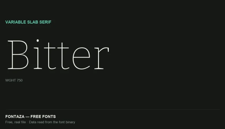
18 features — notably includes both tnum (tabular) and onum/lnum (oldstyle and lining), the same dual-figure flexibility we flagged on Bitter. Useful if this ends up as a UI font sitting next to data tables.
Language and glyph coverage
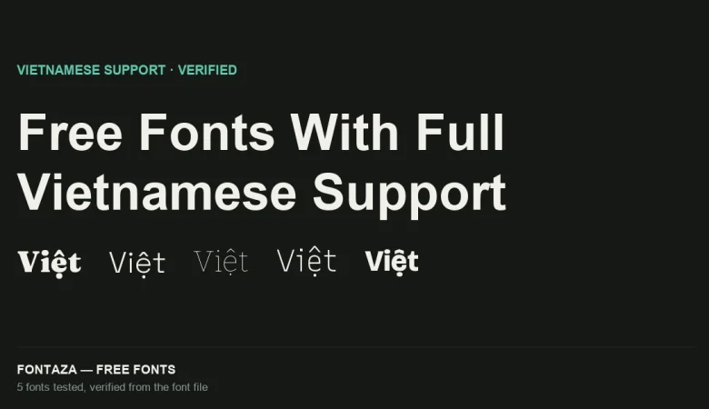
597 glyphs covering 527 Unicode codepoints — the narrowest set of any font covered on this site so far (Fraunces: 698, Space Grotesk: 1,001, Bitter: 1,542). It’s a deliberately display-focused, Latin-only character set. Despite the narrow count, it fully covers Vietnamese — 97 of 256 characters in the Latin Extended Additional block, which is enough to complete every stacked-diacritic combination Vietnamese needs, confirming again that total glyph count doesn’t predict language completeness.
Full coverage: Vietnamese, Spanish, French, German, Portuguese, Italian, Polish, Czech, Turkish, Romanian, Hungarian, Dutch, Nordic. No Greek or Cyrillic.
Metrics
| Metric | Value |
|---|---|
| Units per em | 1,000 |
| Ascender | 930 |
| Descender | −270 |
| Cap-height ratio | 0.660 |
| x-height ratio | 0.528 |
The highest x-height ratio of any font covered on this site (0.528, versus Bitter 0.522 and Montserrat 0.517) — consistent with its identity as a contemporary, UI-leaning grotesque rather than a classical text face.
When to use it — and when not to
Good fit: product marketing sites, SaaS landing pages, anything wanting a trendy, slightly quirky grotesque with real variable flexibility. Poor fit: long-form body text (narrow character set, display-first design), anything needing Greek or Cyrillic, or a true condensed cut for tight spaces.
Related
- Fraunces Variable Font: 4 Axes Explained
- Space Grotesk: Full OpenType Feature Breakdown
- Free Fonts With Full Vietnamese Support (Verified From the Font File)
Data on this page was read directly from the font binary — axis table, glyph count, character coverage and OpenType feature list. Last verified against Bricolage Grotesque version 1.001.