One file, five independent axes
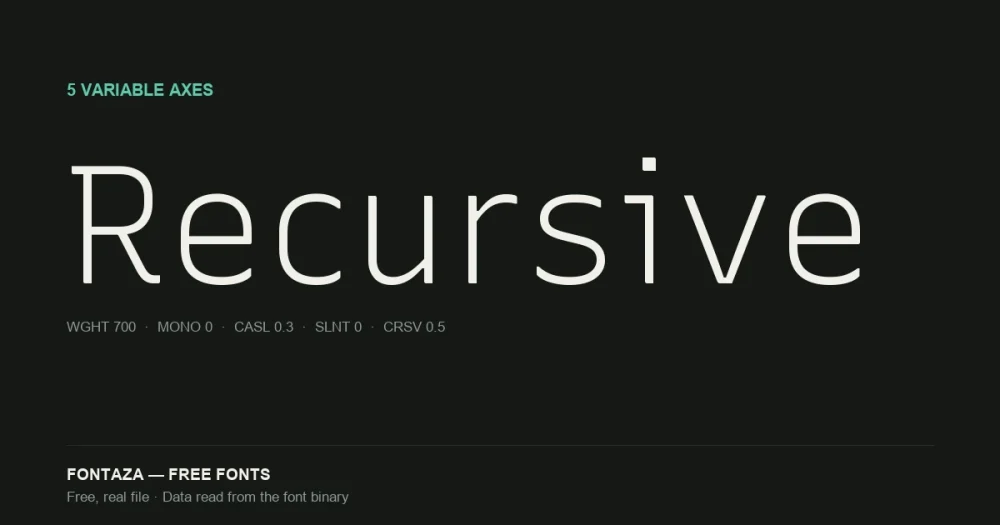
Recursive is unusual even among variable fonts: most have one or two axes. Recursive has five, and two of them — Monospace and Casual — aren’t standard OpenType registered axes at all; they’re custom axes the design team built specifically for this typeface. We read the full axis table directly from the binary:
| Axis | Tag | Range | Default |
|---|---|---|---|
| Weight | wght | 300 → 1000 | 300 (Light) |
| Monospace | MONO | 0 → 1 | 0 (proportional) |
| Casual | CASL | 0 → 1 | 0 (linear) |
| Slant | slnt | −15 → 0 | 0 |
| Cursive | CRSV | 0 → 1 | 0.5 (auto) |
The Weight axis alone is wider than most fonts on this site (up to 1000, past the standard 900 Black ceiling). The Cursive axis defaulting to 0.5 rather than 0 or 1 means it’s set to “automatic” out of the box — it switches cursive-style italic forms in based on the Slant and Casual values rather than committing to one look, which is a genuinely unusual default behavior worth knowing before you embed it.
Download Recursive
Includes the OFL license file. Keep it in the package if you redistribute.
What Monospace and Casual actually do
Monospace (MONO, 0–1). At 0, Recursive is a normal proportional sans. At 1, every character occupies the same width — a genuine monospace, useful for code blocks — without switching font files. Recursive’s own documentation notes that character widths stay identical across the Sans and Mono subfamilies regardless of Weight/Casual/Slant/Cursive settings, which is specifically designed to let you animate between states (e.g., a UI element highlighting on hover) without text reflowing.
Casual (CASL, 0–1). At 0 (“Linear”), letterforms are geometric and controlled. At 1 (“Casual”), strokes pick up curvature, contrast changes, and terminals loosen into something closer to hand-drawn marker lettering. Unlike Fraunces’ Softness axis (a similar idea, covered separately), Casual here works at both the Sans and Mono ends of the Monospace axis — you can have a casual monospace, which is a genuinely rare combination.
33 OpenType features — the widest set on this site
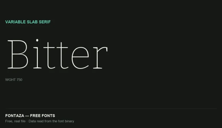
Recursive carries more registered features than any other font covered here (Bitter: 26, Space Grotesk: 26, Bricolage Grotesque: 18). Notably it includes a full set of numbered stylistic sets (ss01 through ss12, plus ss20) and afrc/titl — less common feature tags tied to alternate fraction styles and titling forms.
Language and glyph coverage
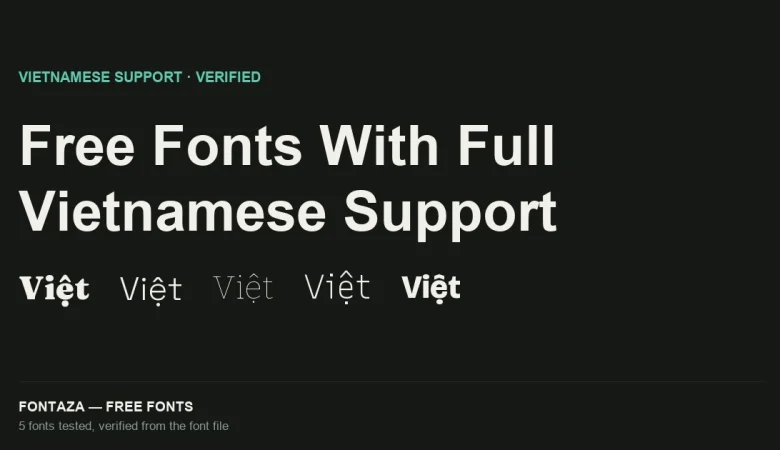
1,304 glyphs covering 745 Unicode codepoints, with full Vietnamese support (164 of 256 in Latin Extended Additional — tied with Bitter for the deepest coverage measured on this site) plus partial Greek (20 of 144).
Full language coverage: Vietnamese, Spanish, French, German, Portuguese, Italian, Polish, Czech, Turkish, Romanian, Hungarian, Dutch, Nordic.
Metrics
| Metric | Value |
|---|---|
| Units per em | 1,000 |
| Ascender | 950 |
| Descender | −250 |
| Cap-height ratio | 0.700 |
| x-height ratio | 0.526 |
When to use it — and when not to
Good fit: design systems and product UIs that need code and interface text to feel like one family instead of two mismatched fonts; anything wanting to animate between states without layout shift. Poor fit: projects that just need “a monospace” or “a sans” — the morphing capability adds real value only if you’re actually using more than one point on the axes; for a single fixed style, a simpler font (see Space Grotesk or Bitter) is easier to work with.
Related
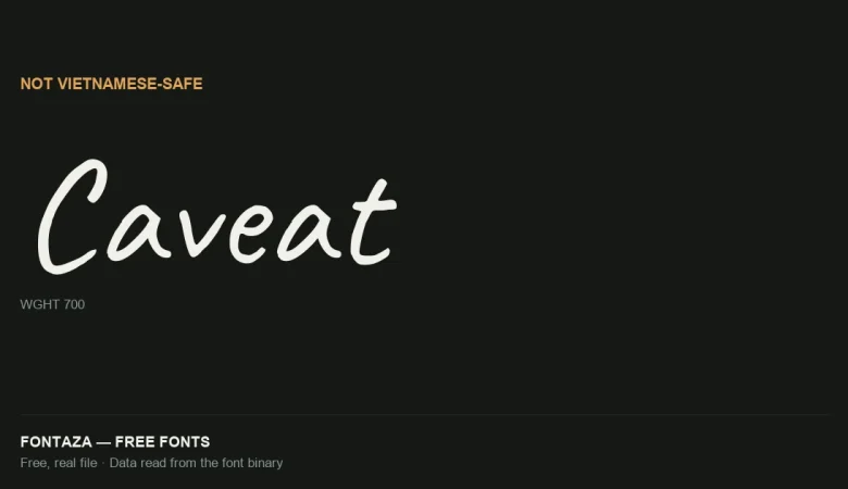
- Caveat: Why It’s Not Vietnamese-Safe
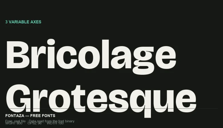
- Bricolage Grotesque: 3-Axis Variable Font Explained
- Free Fonts With Full Vietnamese Support (Verified From the Font File)
Data on this page was read directly from the font binary — axis table, glyph count, character coverage and OpenType feature list. Last verified against Recursive version 1.085.