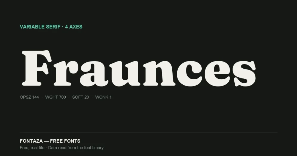
Fraunces has four variable axes — most fonts have one
Fraunces isn’t a font with weights. It’s a font with a continuous design space, and Weight is only one dimension of it. Google Fonts commissioned Flavia Zimbardi and Phaedra Charles of Undercase Type to build it in 2018 specifically to show what a variable font could do beyond “thin to bold” — inspired by early 20th-century display faces like Windsor, Souvenir and the Cooper series.
We read the axis table directly from the font binary. Here’s what’s actually in there:
| Axis | Tag | Range | Default |
|---|---|---|---|
| Optical Size | opsz | 9 → 144 | 9 |
| Weight | wght | 100 → 900 | 900 (Black) |
| Softness | SOFT | 0 → 100 | 0 |
| Wonk | WONK | 0 → 1 | 1 |
Two things worth flagging that you won’t see on a Google Fonts specimen page. The default weight is 900, not 400 — if you embed Fraunces without explicitly setting font-weight, you get Black, not Regular. And Wonk defaults to on (1), so the quirky lowercase forms are the default state, not an opt-in effect.
Download Fraunces
Includes the OFL license file. Keep it in the package if you redistribute.
What each axis does to the letterforms
Optical Size (opsz, 9–144). This isn’t a scaling effect — it swaps structural details. At the low end (9), strokes thicken and spacing opens up for small-size legibility. At the high end (144), Fraunces gets the sharp, high-contrast, almost brittle look you’d want on a poster headline. Most free fonts don’t have this axis at all; you’d normally need separate Text/Display cuts.
Weight (wght, 100–900). Standard weight axis, but paired with Optical Size it behaves differently at each end — a 900-weight letter at opsz:9 looks nothing like a 900-weight letter at opsz:144.
Softness (SOFT, 0–100). Controls how “inky” the strokes look — pushing it up rounds off the sharp terminals and gives the letterforms a blobbier, warmer feel. This is the axis that makes Fraunces read as playful rather than formal at high Softness values, useful for food/lifestyle branding.
Wonk (WONK, 0–1). A binary switch, not a continuous range. At 1 (the default), certain letters — the lowercase a, g, and italic terminals — use asymmetric, hand-lettered-looking alternates. At 0, you get the “corrected,” conventional forms. This is driven by the rvrn OpenType feature under the hood, not a separate glyph substitution you control manually.
OpenType features: only 5, and that’s normal for a display face
| Feature | What it does |
|---|---|
liga | Standard ligatures |
case | Case-sensitive punctuation forms |
ss01 | Stylistic Set 1 |
kern | Kerning |
rvrn | Required Variation Alternates — the mechanism that drives the Wonk axis |
Compare this to a text-oriented sans like Space Grotesk (26 features, covered separately) — Fraunces trades feature breadth for its four-axis design space. rvrn specifically is worth knowing about: it’s not a feature you toggle in your design software, it activates automatically based on where the Wonk axis is set.
Language and glyph coverage
Fraunces ships 698 glyphs covering 624 Unicode codepoints — narrow for a font this well-known, because it’s built for display use, not long-form text.
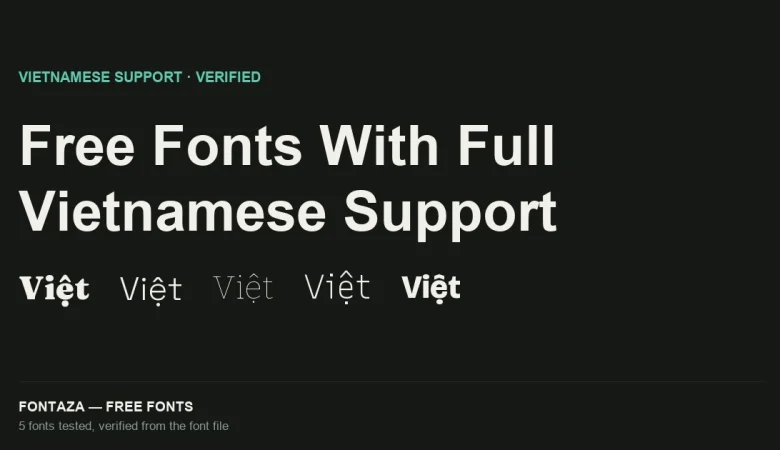
Despite the narrow glyph count, it fully covers Vietnamese, including precomposed stacked diacritics (ế, ộ, ữ, ỹ) — 154 of 256 characters in the Latin Extended Additional block, enough to complete every combination Vietnamese needs. This matters because glyph count alone doesn’t predict language support: a font can be narrow overall and still be complete where it counts, or wide overall and still miss a script.
Full coverage: Vietnamese, Spanish, French, German, Portuguese, Italian, Polish, Czech, Turkish, Romanian, Hungarian, Dutch, Nordic (Danish/Norwegian/Swedish). No Greek or Cyrillic.
Metrics: the units-per-em is 2,000, not 1,000
| Metric | Value |
|---|---|
| Units per em | 2,000 |
| Ascender | 1,956 |
| Descender | −510 |
| Cap-height ratio | 0.700 |
| x-height ratio | 0.482 |
Most fonts (including Space Grotesk and Montserrat, both covered on this site) use a 1,000 upm grid. Fraunces uses 2,000. This only matters if you’re doing manual metric math — CSS font-weight/font-size behave identically either way — but if you’re hand-tuning kerning pairs or building a custom variable font instance picker, doubling every value you’d expect from a 1,000-upm font is the fix.
The x-height ratio of 0.482 is lower than Montserrat’s 0.517 — expected for a display serif, where smaller x-height reads as more elegant at large sizes but hurts legibility in small body text. Don’t set this below 16px.
When to use it — and when not to
Good fit: editorial headlines, cookbook and recipe sites, wedding branding, packaging that wants warmth without looking generic-script. The Soft + Wonk combination gives you a “hand-finished” look without hiring a lettering artist.
Poor fit: body text below 16px (low x-height), anything needing Greek or Cyrillic, UI/dashboard work (use Space Grotesk instead — narrower personality, wider feature set for tabular data).
Related
- Space Grotesk: Full OpenType Feature Breakdown
- Bitter: Variable Slab Serif Explained
- Free Fonts With Full Vietnamese Support (Verified From the Font File)
Data on this page was read directly from the font binary — axis table, glyph count, character coverage and OpenType feature list — not copied from a third-party listing. Last verified against Fraunces version 1.000.
Sources: Google Design — Fraunces, Undercase Type