It started as a monospace font
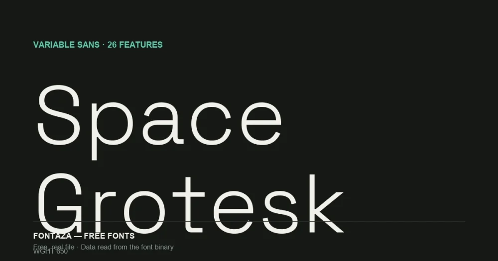
Space Grotesk is a proportional derivative of Space Mono (Colophon Foundry, 2016) — Florian Karsten reworked the fixed-width original into a proportional sans in 2018, keeping the idiosyncratic details (the unusual Q tail, the slightly squared bowls) that made Space Mono distinctive, while fixing what made it a poor choice for anything longer than a headline: fixed-width letterforms waste space and hurt readability in body text.
That lineage explains why Space Grotesk reads as “technical” without being a monospace font itself — the DNA is there, but the spacing is normal.
Download Space Grotesk
Includes the OFL license file. Keep it in the package if you redistribute.
The variable axis is narrower than it looks
| Axis | Tag | Range | Default |
|---|---|---|---|
| Weight | wght | 300 → 700 | 300 (Light) |
One axis, and it runs 300 to 700 — Light to Bold. No Thin, no ExtraBold, no Black. That’s a real ceiling: if a brand system needs a heavy display cut of Space Grotesk for a logo lockup, this file can’t produce one — you’d need to fake it with font-weight: bolder synthesis (which most browsers will do, badly) or pick a different typeface for that one use.
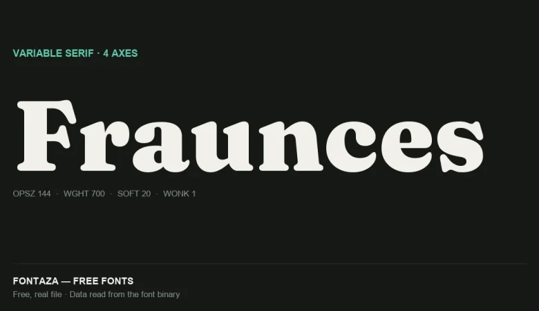
The default is 300, not 400. If you link the variable font without setting font-weight explicitly, you’ll render Light, not Regular — the opposite trap from Fraunces (covered separately), which defaults to Black.
Named weights available: 300 Light, 400 Regular, 500 Medium, 600 SemiBold, 700 Bold.
26 OpenType features — more than most paid fonts
This is unusually feature-rich for a free font. Full list, read directly from the GSUB/GPOS tables:
| Category | Features |
|---|---|
| Figures | lnum onum pnum tnum numr dnom frac zero |
| Stylistic sets | ss01 ss02 ss03 ss04 ss05 salt aalt |
| Case & script | case sups subs sinf ordn |
| Positioning | kern mark mkmk |
| Composition | ccmp locl |
| Ligatures | liga |
Two groups are worth using deliberately:
Tabular figures (tnum). If you’re building a pricing table, dashboard, or any UI with stacked numbers, turn this on — digits align in fixed-width columns instead of proportional widths that make columns of numbers look ragged. This is the single most practically useful feature on this list for SaaS/product UI, which is exactly where Space Grotesk gets used most.
Five stylistic sets (ss01–ss05). Most free fonts ship zero or one. We haven’t mapped what each set changes visually yet — that requires rendering glyph-by-glyph comparisons, which is a separate piece of content — but the presence of five is itself notable: it signals the designer built in more typographic flexibility than a typical free geometric sans.
Glyph coverage and language support
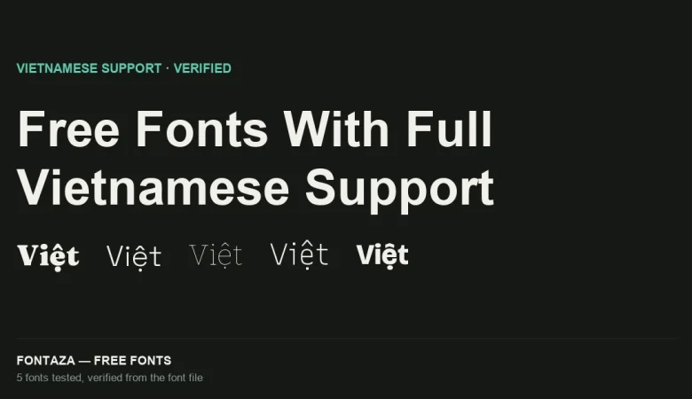
1,001 glyphs covering 735 Unicode codepoints — wider than Fraunces (698/624), narrower than Montserrat (2,747/1,312). It fully covers Vietnamese, including precomposed stacked diacritics — 168 of 256 characters in the Latin Extended Additional block.
Full language coverage: Vietnamese, Spanish, French, German, Portuguese, Italian, Polish, Czech, Turkish, Romanian, Hungarian, Dutch, Nordic (Danish/Norwegian/Swedish). Greek is present but only 3 characters — not usable for Greek text, same limitation as most fonts in this Latin-focused category.
Metrics
| Metric | Value |
|---|---|
| Units per em | 1,000 |
| Ascender | 984 |
| Descender | −292 |
| Cap-height ratio | 0.700 |
| x-height ratio | 0.486 |
Standard 1,000 upm grid (unlike Fraunces’ 2,000). x-height ratio of 0.486 sits between Montserrat (0.517, more open) and Fraunces (0.482, tighter) — mid-range, which is part of why it reads comfortably at both UI text sizes and display sizes without needing an optical-size axis to compensate.
When to use it — and when not to
Good fit: tech/SaaS product branding, developer-tool marketing sites, dashboards and data-heavy UI (thanks to tnum), anything wanting a “technical but not code-y” feel. The Space Mono lineage reads as intentional, not accidental, when used at headline sizes.
Poor fit: anything needing weights above 700 or below 300, logo lockups wanting a true Black cut, Greek-language content, and long-form editorial where a warmer serif (see Fraunces) fits the tone better.
Related
- Bitter: Variable Slab Serif Explained
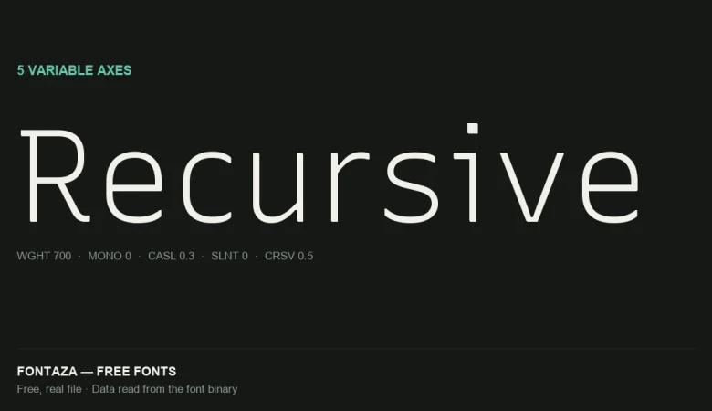
- Recursive: 5 Variable Axes Explained
- Free Fonts With Full Vietnamese Support (Verified From the Font File)
Data on this page was read directly from the font binary — axis table, glyph count, character coverage and OpenType feature list — not copied from a third-party listing. Last verified against Space Grotesk version 2.000.
Sources: Florian Karsten — Space Grotesk, GitHub — floriankarsten/space-grotesk