The benchmark casual handwriting font
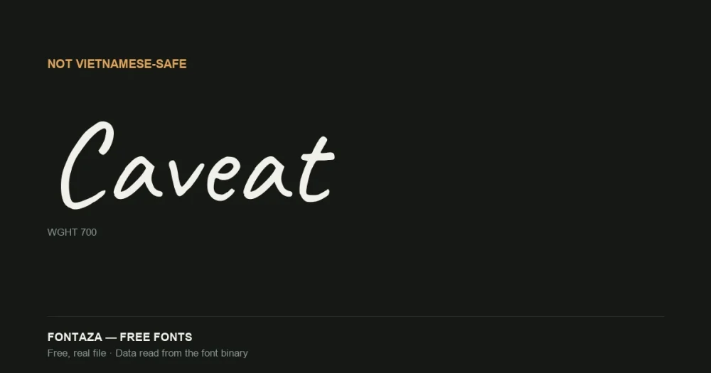
Caveat, designed by Pablo Impallari, is one of the most widely used free handwriting fonts on the web — breezy, unhurried letterforms that read like someone writing quickly with a smooth pen, without tipping into the illegibility a lot of script fonts have at small sizes.
We tested it the same way we test every font on this site: reading the actual character data out of the binary, not repeating a vendor description.
| Property | Value |
|---|---|
| Variable axis | Weight (wght), 400 → 700, default 400 |
| Named weights | 4 (Regular, Medium, SemiBold, Bold) |
| Glyphs | 1,034 |
| Codepoints | 753 |
| OpenType features | 16 |
| Vietnamese support | Partial — not full |
Download Caveat
Includes the OFL license file. Keep it in the package if you redistribute.
Why we’re flagging this instead of just listing it
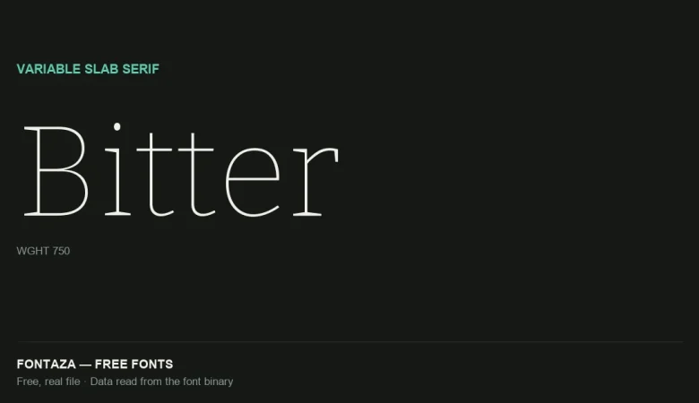
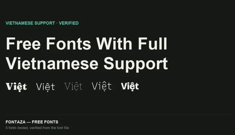
Most of the fonts on this site pass our Vietnamese-support test cleanly (see Fraunces, Bitter, and the full Vietnamese-support roundup). Caveat doesn’t, and we think that’s more useful to know than to quietly omit.
Caveat’s character set fully covers Cyrillic (220 of 256 in the Cyrillic block) but only reaches 34 of 256 characters in the Latin Extended Additional block — the block that holds Vietnamese’s stacked diacritic combinations (ế, ộ, ữ, ỹ, and dozens more). In practice: basic Vietnamese base letters with a single diacritic may render, but many two-mark combinations (a Vietnamese-specific vowel plus a tone mark) will fall back to a missing-glyph box or a visually broken stack.
If your project needs Vietnamese text in a casual handwriting style, this isn’t the file to use — check the Vietnamese-support roundup for fonts that pass completely, or reach for a premium option verified for the language you need.
OpenType features
| Category | Features |
|---|---|
| Alternates | aalt salt ss01 ss02 |
| Positioning | kern mark mkmk |
| Other | calt case dlig frac liga locl ordn subs sups |
16 features is a reasonable set for a script font — calt (contextual alternates) matters most here, since handwriting fonts rely on it to swap letterforms based on neighboring characters and avoid the repetitive, stamped-out look that plain script fonts get when the same glyph repeats.
Metrics
| Metric | Value |
|---|---|
| Units per em | 1,000 |
| Ascender | 960 |
| Descender | −300 |
| Cap-height ratio | 0.610 |
| x-height ratio | 0.400 |
An x-height ratio of 0.400 is low compared to the sans and slab fonts on this site (Montserrat 0.517, Bitter 0.522) — expected for a script face, where a low x-height is part of what reads as “handwritten” rather than “typeset.” Don’t use Caveat below 18–20px; the low x-height makes small sizes hard to read.
When to use it — and when not to
Good fit: headlines, quotes, social graphics, invitation-style branding, anything Latin/Cyrillic where a personal, unhurried tone matters. Poor fit: Vietnamese-language content (see above), body text at small sizes, anything requiring a formal or corporate tone.
Related
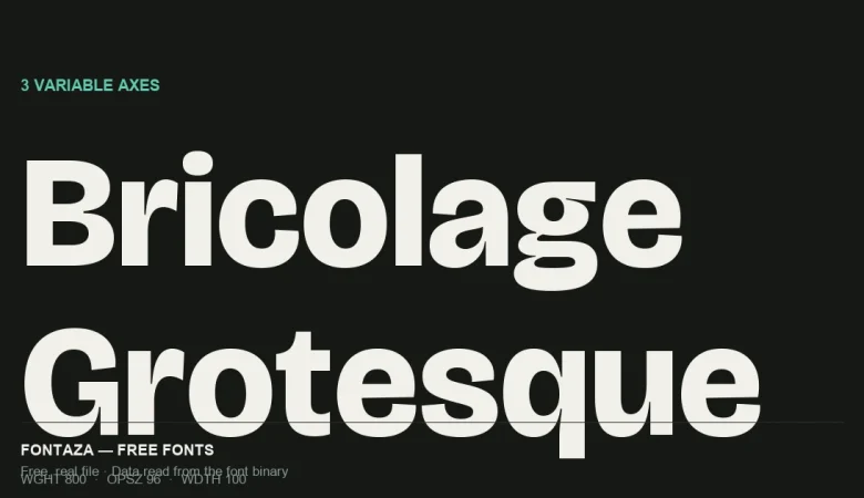
- Bricolage Grotesque: 3-Axis Variable Font Explained
- Fraunces Variable Font: 4 Axes Explained
- Free Fonts With Full Vietnamese Support (Verified From the Font File)
Data on this page was read directly from the font binary — axis table, glyph count, character coverage and OpenType feature list. Last verified against Caveat version 2.000.